











Instagram Font Generator: Style Your Bio and Captions
An Instagram font generator turns plain text into fancy fonts you can paste into your bio and captions. Cursive, bold, and dozens of styles, copied in a single tap.
Open this article in a favorite AI assistant for a quick summary and analysis.
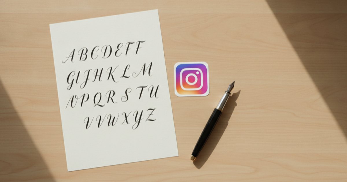
A standout Instagram profile starts with how the text looks
If you want a bio that makes someone pause instead of scrolling past, the way your text looks carries a lot of that weight. Instagram itself only gives you one plain typeface, so every profile written in it blends into the next. That is exactly the gap an Instagram font generator fills: it takes the words you already wrote and hands them back in cursive, bold, gothic, or dozens of other styles you can drop straight into your bio. These styles are what most people mean when they search for ig fonts or fancy Instagram fonts.
None of this requires design skills or an extra app. A few seconds of copying and pasting is enough to make a profile read as intentional rather than default, and that small difference is often what gets a name remembered.
What an Instagram font generator actually does
There is a common misunderstanding worth clearing up first. These tools do not install a new typeface on Instagram, because Instagram has no font settings at all. What an Instagram font generator does instead is swap your regular letters for Unicode characters that happen to look fancy.
Unicode is the universal character standard behind every emoji, symbol, and alphabet your phone can display. Tucked inside it are full sets of styled letters: mathematical bold, script, monospace, circled, and more. When a generator turns "hello" into a cursive version, it is not styling the word; it is replacing each letter with a different character that already exists in Unicode and renders almost everywhere.
That distinction matters because it explains both the magic and the limits. The text travels with you into any bio or caption, but it is technically a string of special symbols rather than formatted text.

How to use an Instagram font generator step by step
The workflow is short and the same across almost every tool:
- Type or paste the text you want to style into the input box.
- Browse the live previews; most generators show your words in every available style at once.
- Tap copy next to the style you like best.
- Open Instagram, paste the text into your bio, name field, or caption, and save.
A free Instagram font generator such as the Simpliers font generator shows every style in one place and copies with a single tap, so the whole process takes well under a minute. Because the output is plain Unicode, nothing gets lost between copying and pasting.
Where stylish fonts work best on a profile
Fancy text fits some spots better than others, and knowing where to place it keeps a profile looking polished rather than cluttered.
Bio: the most popular use. A styled line or two adds personality without changing your handle.
Name field: the bold name under your profile picture is searchable, so a light styling here stands out while staying readable.
Captions: a styled opening line can act like a headline and pull people into the rest of the text.
Story text and highlights: short labels in a matching style tie a profile together visually.
The pattern that works is restraint. One or two styled accents read as design; an entire profile in script becomes hard to read.
Common mistakes with fancy fonts
A few habits quietly work against you, and they are easy to avoid once you know them.
Overusing styles is the big one. When every word is decorated, nothing draws the eye and the bio gets harder to scan.
Accessibility is the more serious issue. Screen readers interpret Unicode styled letters as individual symbols, so a name written entirely in script can come out as gibberish for anyone using assistive tech. Keeping your core information in normal text and reserving fancy fonts for accents protects everyone's experience.
There is also the device problem. Not every character set renders on every phone or app, so an exotic style that looks perfect on your screen can appear as empty boxes elsewhere. Sticking to widely supported styles like bold and script avoids most of these breaks.

Picking a style that fits the profile
The best style is the one that matches the rest of the account. A clean monospace suits a minimal photography feed; flowing script fits beauty, weddings, or lifestyle; bold works when the goal is to look confident and direct.
Consistency does more than any single fancy choice. Reusing the same one or two styles across the bio, highlights, and captions makes a profile feel designed rather than improvised, and it keeps the focus on the content instead of the decoration. For accounts built around a personal brand, the same care that goes into the visuals belongs in how an influencer presence is grown and managed day to day.
Quick answers on Instagram fonts
Are Instagram fonts safe to use
Yes. An Instagram font generator only converts your text into standard Unicode characters, so nothing is installed and no account permissions are involved. You are simply pasting symbols that already exist in the character set, which is completely within Instagram's normal use.
Why do some fancy fonts show up as boxes
Because that specific character set is not supported on the device or app viewing it. Unicode styled letters render only where the system recognizes them, so a rare style can display as empty boxes on older phones. Widely supported styles like bold and script avoid this.
Do fancy fonts hurt accessibility
Sometimes. Screen readers may read styled Unicode letters as separate symbols rather than words, which makes fully styled text hard to follow for assistive tech users. Keeping essential information in plain text and using fancy fonts only as accents keeps a profile readable for everyone.
Bringing it all together
A profile that looks intentional rarely happens by accident, and the quickest lever is the one most people overlook: the text itself. An Instagram font generator gives you cursive, bold, and dozens of other styles in seconds, with no design work and no extra app. Use it with a light hand, keep your key information readable, and reuse one or two styles for consistency. That small bit of polish is often what turns a passing glance into a follow.